In today’s digital age, online searches steer consumer decisions. Having a responsive website is no longer a luxury—it’s a necessity, especially with the number of smartphone users on the rise.
For auto detailing shops, a responsive web design can be the key to unlocking a broader audience and ensuring a seamless user experience across various devices. Let's explore some responsive website design best practices to rev up your online presence and drive success.
What is Responsive Website Design?
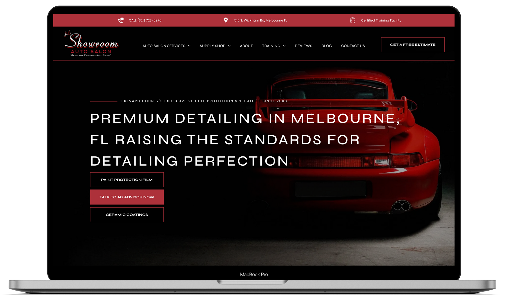
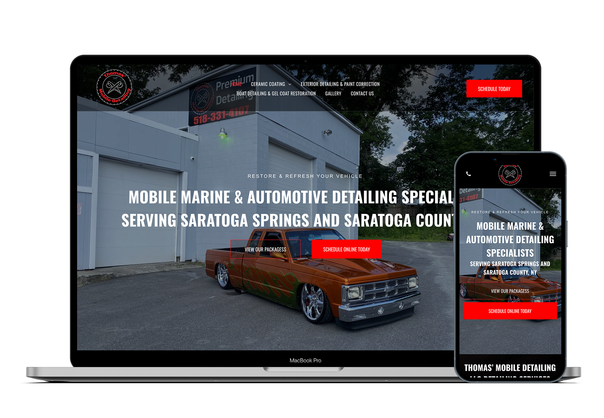
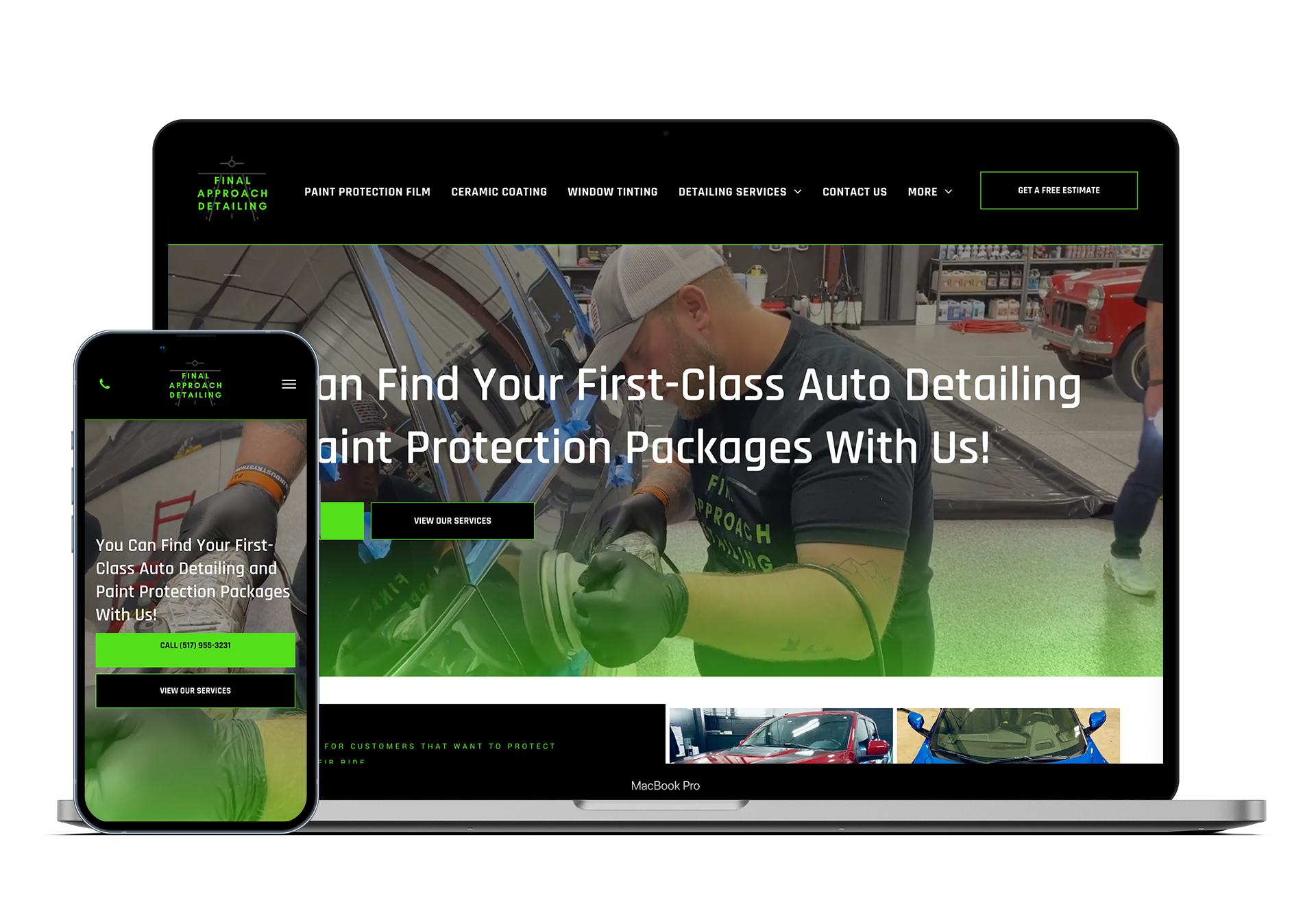
Responsive website design is a dynamic and adaptive approach to crafting websites that ensures optimal user experience across various devices and screen sizes. In essence, a responsive website responds to the user's behavior and environment, delivering content in a format that is easily accessible and visually appealing on any device, be it a desktop, laptop, tablet, or smartphone.
The primary goal of responsive website design is to eliminate the need for separate mobile and desktop versions, streamlining maintenance and enhancing consistency across platforms. In essence, responsive design is a forward-thinking strategy that offers many benefits, such as delivering optimal user experience and maximizing online visibility.
Adopting a Mobile-First Approach
The road to a responsive website begins with adopting a mobile-first approach. With mobile devices dominating internet traffic, it's imperative to prioritize designing for smaller screens. According to Google's mobile-first indexing, websites that prioritize mobile responsiveness are more likely to rank higher in search results, a crucial aspect for auto detailing shops aiming to attract local customers seeking detailing services on-the-go.
Establishing Clear Breakpoints
Implementing CSS media queries is akin to having a GPS system for your website's responsiveness. By defining specific breakpoints for different screen sizes or device types, you ensure that your website adjusts its layout seamlessly. This enhances user experience and aligns with search engine preferences, boosting your website's visibility and accessibility.
Utilizing Flexible Grid Systems
Leverage flexible grid systems like CSS Flexbox or CSS Grid to navigate the twists and turns of responsive design. These tools allow you to create layouts that adapt effortlessly to various screen sizes, providing a consistent and visually appealing experience across devices.
Optimizing Images for Different Screens

Speed matters. Optimize images for different screens and device types to ensure fast loading times without compromising image quality. This improves user experience and aligns with SEO practices, as search engines favor websites that load quickly, especially on mobile devices.
Considering Typography Carefully
Typography plays a significant role in how users engage with your website. Choose fonts that are aesthetically pleasing, readable, and scalable across different screen sizes and devices. This ensures your content remains engaging and accessible, catering to a diverse audience.
Prioritizing Accessibility
Accessibility and inclusivity are ethical and essential. Ensure your responsive design adheres to web accessibility guidelines, making your auto detailing website usable for people with disabilities. This expands your potential customer base and aligns with search engine algorithms that reward websites prioritizing inclusivity.
Testing Thoroughly Across Devices
Rigorously test your responsive design across a spectrum of devices, from sleek smartphones to expansive desktops. This quality assurance ensures that your auto detailing website performs seamlessly, regardless of your potential customers' device. Comprehensive testing improves user satisfaction and aligns with search engine expectations, contributing to higher rankings.
Iterating and Refining
Regularly iterate and refine your website based on user feedback, emerging technologies, and evolving usage patterns. By staying responsive to the dynamic nature of the internet, your auto detailing website remains competitive and aligned with the latest SEO trends.
What These Best Practices Mean for Your Auto Detailing Business
Adopting best practices for responsive design is not just about creating a visually appealing website—it's about ensuring that your auto detailing business stays in the fast lane of online success.
By prioritizing mobile-first design, implementing clear breakpoints, utilizing flexible grid systems, optimizing images, considering typography, prioritizing accessibility, testing thoroughly, and iterating continuously, your auto detailing website can accelerate ahead of the competition, attracting and retaining customers in this digital age.
Create a Responsive Website for Your Auto Detailing Shop
Ready to steer your auto detailing business towards digital success? Don't let your website lag behind the competition. It's time to invest in a responsive website that captures attention and converts visitors into loyal customers.
Trust Detailers Roadmap for expert website development and SEO tailored to the unique needs of auto detailing shops. Our team understands the intricacies of the industry and is committed to revving up your online presence.
Shift into high gear and contact Detailers Roadmap today so you can implement these best practices for responsive design into your website!